How to use
Headings
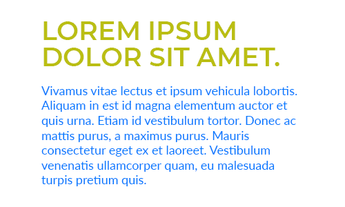
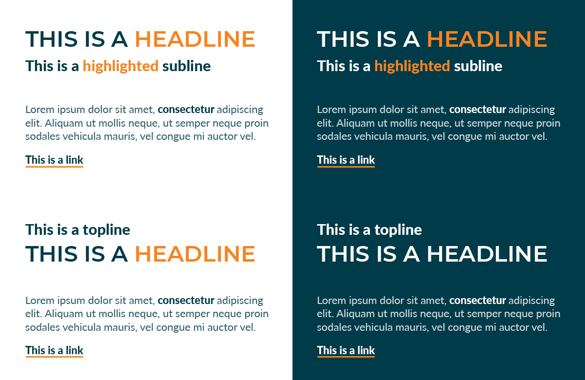
All large Kongsberg PCS headings should be set in Montserrat SemiBold, as all caps(*). The color for headings should be set to Spruce Blue on light backgrounds, or white on dark backgrounds. If parts of the heading need to be highlighted, set the text color to Apricot Orange for the highlighted parts. Never set the font weight for Montserrat type to anything else than SemiBold.
The smaller (sub)headings need to be set in Lato Heavy, as mixed-case. These smaller headings should be set to Spruce Blue on light backgrounds, or white on dark backgrounds. Highlighting should also be achieved by applying the Apricot Orange color where needed.
(*) For longer headings that would span 3 or more lines, it is allowed to use Lato Heavy in mixed-case instead.
Text
The body copy should be set in Lato Regular, as mixed-case. When set on light backgrounds, the color of the body text should be set to 80% Spruce Blue. When set on dark backgrounds, the color of the body text should be set to either white or 20% Spruce Blue. Highlights in the body copy should be achieved by setting the font weight to Heavy, with the font color set to 100% Spruce Blue or 100% white.
Set the font weight to Heavy for interactive text elements, with the color set to Spruce Blue for light backgrounds or white for dark backgrounds. Links should be underlined with a thick, solid orange line underneath.
Summary
- Headlines: Montserrat SemiBold - All caps - Spruce Blue or white
- Sublines & toplines: Lato Heavy - Mixed-case - Spruce Blue or white
- Highlights in headlines, sublines & toplines: Apricot Orange
- Body text: Lato Regular - Mixed-case - 20% or 80% Spruce Blue, or white
- Highlights in body text: Lato Heavy - Mixed-case - Spruce Blue, or white
- Interactive text elements: Lato Heavy - Mixed-case - Spruce Blue or white - Thick, solid, orange underline
- Buttons: Lato Heavy, Mixed-case, white text on Orange rectangle with rounded corners
Notes
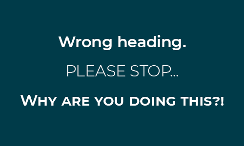
The Montserrat typeface may only be set in all caps. Never use Montserrat in lowercase type.
Exemptions
In some cases it might not be possible to use Montserrat and/or Lato due to limitations in compatibility (i.e. HTML emails, Office apps, etc.). For these situations the font family Arial should be used for both headings and body text.
The font styles and colors remain largely the same as with Montserrat and Lato (with SemiBold and Heavy turning into Bold), apart from the large headings, which should become mixed-case instead of all caps.